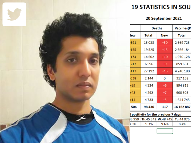
SEE: Durban maths teacher uses his knowledge to become a pro at Twitter
Updated | By East Coast Radio
Sugan Naidoo, a Durban maths teacher, uses Twitter to share his knowledge and it sparks interest amongst tweeps...

We have heard many stories about people who have used the hard lockdown as a means to follow a passion, or even find their passion, but this story works backwards.
It shows how someone can use their time and their skills to do well at something that hasn't really been their forte in the past. And the great part is that he is from Durban, so we have even more to cheer about.
Sugan Naidoo, a maths teacher, found that the statistics that the Department of Health provided when it came to the COVID-19 numbers were both confusing and didn't really paint a clear picture of what we were dealing with.
So he decided to use his knowledge and this gap in communication to create charts and tables that would provide a clearer picture for South Africans when it came to the breakdown of the COVID-19 numbers.
"When Durban-based maths teacher Sugan Naidoo started tweeting about the Covid-19 pandemic in April last year, he had just 35 followers. Eighteen months later, he has over 23,000 followers - among them some of the country's most respected doctors, journalists, and politicians," Business Insider reports.
A huge leap for someone who isn't a social media person, but nevertheless did his thing and it clearly worked. Considering he has a following of over 20,000 people shows that he used his skills, partnered with a gap in the market, and made things work.
Sometimes that's all you need. His success has been upvoted to the point that "he's been asked for advise about the peaks of the next waves and spoken to provincial Covid-19 response teams about how best to communicate messages around the pandemic to the general public. Naidoo's jump from unknown Twitter user to leading Covid-19 tweeter is due to a combination of lockdown boredom, frustration with official Covid-19 reporting, persistence, and his ability to deliver a clear and concise message due to his experience as a maths, and maths literacy teacher," Business Insider adds.
Even today, the Department of Health's infographics don't show how many Covid-19 cases there are per province. They just show total cases and total deaths. When you show totals, it's largely meaningless - because it doesn't give you a sense of the current situation.- Sugan Naidoo
SA COVID UPDATE 20 SEPTEMBER
— sugan naidoo (@sugan2503) September 20, 2021
• Changes from yesterday highlighted
• Adults vaccinated per province
Very poor day for vaccines, it was the lowest weekday since 13 August. pic.twitter.com/i25zlMTdka
I had to try and find new things all the time to build my audience, so the first two or three months I spent up to six hours a day trying to build the graphs and tables and looking for new information.- Sugan Naidoo
He doesn't have the time nowadays to come up with new ways of bettering his content but he still posts and updates his audience when it comes to the numbers and creating efficient and easy-to-understand tables.
With innovators such as Sugan, it goes to show that when you match your passion with a gap in the market, you can reach people with your messaging, even if that wasn't your initial intention.
Adults vaccinated per province
— sugan naidoo (@sugan2503) September 20, 2021
• EC still leading in terms of adults fully vaccinated with a quarter of adults done while NW had the best week with a 2.24% change
• GP is probably going to fall to last place soon at the current rate and is pulling the national % down with it pic.twitter.com/Pyv9p8aA3e

Image Courtesy of Twitter
Show's Stories
-
A queue at the drive-thru? Not for this taxi
Don't you just hate being stuck at a drive-thru? Well, this South Africa...
East Coast Breakfast 23 hours ago -
Durban traffic: Things motorists do when they see traffic
This is an example of what not to do if you get stuck in traffic this Ea...
Carol Ofori 23 hours ago